Helvetica?
Yes, I am talking about Helvetica the font face. In e-zine this past week we watched a movie about fonts, Helvetica being the main one.
You might not have noticed, but font plays a very important part in conveying a message. Different fonts are capable of manipulating your emotions to feel a different way. For instance, if I were to write something in Helvetica-type font, your mind would practically scream: CORPORATE. This font is very straight to the point and if I was to use the Curlz font my mind would think: GIRLY.
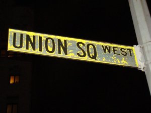
For example, below are pictures of the American Airline logo and then a street sign. Both are written using the font called Helvetica, this makes sure that something seems uniform and professional.
American Airlines are a company and it needs to look professional, and the street signs need to be legible and whatnot so, Helvetica is needed.
American Airlines was referenced in the movie as one company that is all for Helvetica, the street signs were also.


I don’t really like Helvetica!! hee hee
well it is just kind of boring but i guess that it works well for a simple design and what the people are trying to say. 🙂
I love the examples you used!! I swear that if I have to watch that Helvetica movie ever again in my life, I will punch someone in the face. And all of these people obsessed with fonts kinda makes me sick.
I think that people who make street signs also really use helvetica-type fonts for the sake of readability. if street signs looked handwritten, no drivers would be able to tell what they say.